
Say Hello to Pantone Colors of the Year for 2016
Sensing the public’s dire need of reprieve from the turbulence of politics, violent shootings, and destructive weather, the Pantone Institute chose two calming colors, Rose Quartz (pale pink) and Serenity (light blue) as Colors of the Year for 2016.

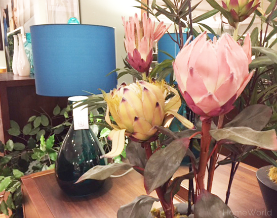
Rose Quartz (pale pink) and Serenity (light blue) are the Pantone Colors of 2016. Shown: June Apartment Sofa by Stylus.
According to pantone.com, “Rose Quartz is a persuasive yet gentle tone that conveys compassion and a sense of composure. Serenity is weightless and airy, like the expanse of the blue sky above us, bringing feelings of respite and relaxation even in turbulent times.”
This is the first time Pantone has selected two colors as Color of the Year. Last year, Pantone selected Marsala as the color for 2015.
As stated at pantone.com, the selection process is symbolic, representing a color snapshot of what is happening in our culture.
In many parts of the world we are experiencing a gender blur as it relates to fashion, which has in turn impacted color trends throughout all other areas of design. (pantone.com)
Soft and pretty, Rose Quartz and Serenity are a revolt against the gender codes, creating a universal canvas that is adaptive to every style. The harmonious pairing can be seen on celebrities, fashion runways, magazine covers, and in store windows.
Who wouldn’t want to escape the world of craziness and come home to the calming and comforting colors of tranquility?
Read more about Pantone Colors of the Year at pantone.com.
